How To Create a High Converting Lead Capture Page
“The money is in the list!” Even if you’ve been online only for a month, you would have heard that phrase. But what you want to know is why you need a list and how you make money from it.
A squeeze page, teaser page, lead capture magnet and lead capture page all mean the same thing. They refer to a website or a blog that has been created with a specific objective:
*Capturing a visitor’s name and email address, and perhaps even their phone and zip code.*
This exercise is intended to turn visitors into subscribers (potential customers) that you can build a relation with, and market your products or services to, in the long-term.
Why Should Visitors Give You Their Email Address?
Do you remember a time when you gave away your email address on a page? If you did, why did you do it? You may have been offered something you were looking for or needed.
When we come down to the essentials, the best-converting lead capture page is one that offers to provide the benefit (or a road map to the benefit) the visitor was seeking when they clicked on the link.
People surf the Internet like in the fog – they don’t see anything, unless their problem is addressed. They give you their name and email when they see you offering what they need.
Does that make sense?
Some copywriters call it “entering the conversation taking place in the visitor’s head.”
Create a simple lead capture page that focuses on a benefit that people really want like crazy. You will have opt-ins flowing in…
The Key Elements Of A Great Lead Capture Page
#1. A Sizzling Headline
“On the average, five times as many people read the headline as read the body copy. When you have written your headline, you have spent eighty cents out of your dollar.”- David Ogilvy
A headline is the most critical element of a capture page and it’s the first thing that catches the eye of the visitor. The idea it expresses should relate to the visitor’s needs and pique curiosity. It should create a desire and encourage the visitor to taste, in order to whet his appetite. Make it reader-oriented but hype-free.
 Look at the headline on Andy Jenkins’ lead capture page. It tells people what they can do if they’re starting from scratch. The bullet points reveal that they don’t need to have a list, product or joint venture partners. This is a big deal for a newbie trying to step up his marketing efforts. If I were a newbie, I would certainly opt-in to find out more.
Focus on results that 99% of people are looking for:
– To be more attractive
– To be healthier
– To be more productive
– To solve a problem
– To be wealthier
– To feel safer
– To be happier
Tip: A headline on a lead capture page does not sell a business opportunity; it sells the opt-in.
#2. Float It Above The Fold
Give visitors the option to scroll down on your capture page for the opt-in form and you lose most of them. Making it quick by having the opt-in form above the fold has been seen to increase conversion rates, although many bloggers don’t comply with this tested principle. Personally, if my main objective is to get people onto my list, a prominent opt-in form above the fold is non-negotiable for my capture page.
 This is one of my favorite opt-in forms. It’s above the fold and the colors are so attractive that your eyes go straight to the form.
A great idea is to frame up the opt-in form and isolate om the rest of the page. If you’re using a plain design for your lead capture page, it may not be a bad idea to have a colored border for the opt-in form. The idea is to sublimely drive the visual focus of your visitors towards the form.
Tip: Many smart designers place an arrow pointing to the form.
#3. A Strong Call To Action
The one and only goal of a lead capture page is to turn a visitor into a subscriber by entering his/her name and email address, isn’t it? In order to achieve that goal, you have to ensure the opt-in form stands out from the rest of the page, so that your visitors know exactly what their next action has to be: they must enter their contact details to proceed.
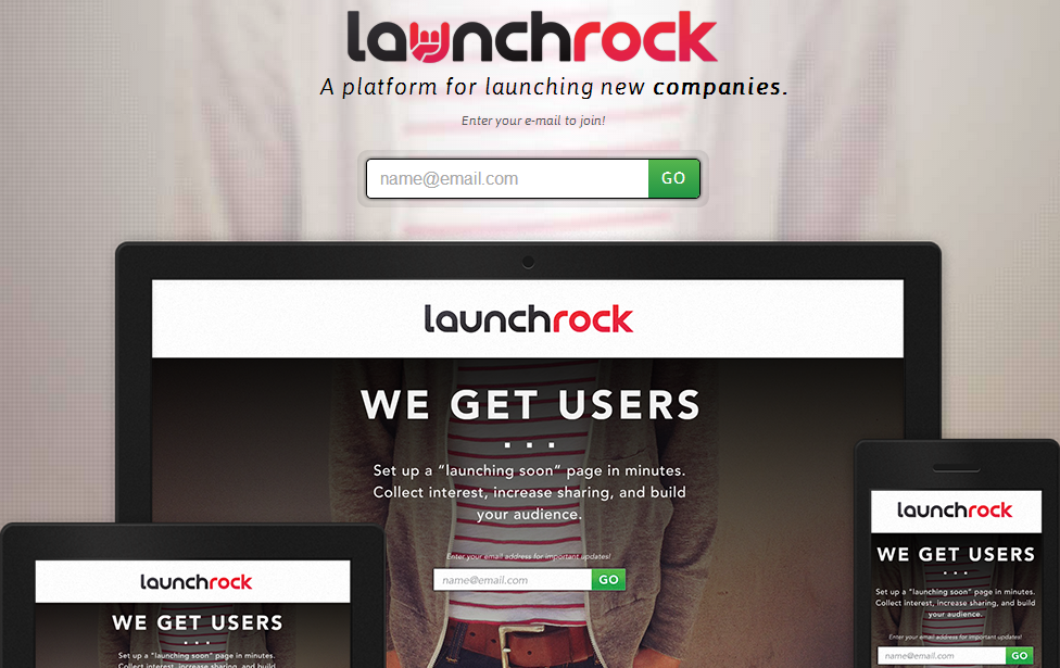
Notice how Lauchrock addresses the quickness of the sign up process through its CTA. It conveys that it is not a hassle at all and offers a lot of benefits.
So make sure you let them know what they have to do in a short sentence. Tell them to “Enter Your Email ID To Download The Free Report” or whatever it is you are offering.
Tip: The call to action has to be strong and convey the benefit.
#4. A Simple Uncomplicated Design
The lead capture page have evolved so much today, but the ‘keep it simple’ model still works like a charm.
 It is the simplicity and the lack of distractions in this capture page that make it powerful.
I have found that simple and clean designs with white background layouts score the highest opt-in ratios. Flashy graphics on the other hand have proven to be counter-productive. It must have something to do with the fact that they are easy on the eye and appealing.
Tip: The less information you ask from people the higher the conversions.
Lead Capture Page Take Away..
The lead capture page is all about making visitors join your list. But you will only achieve success when you really understand why people join lists even before you start developing your lead capture page. Look at things from their perspective and then deliver the goodies. Perseverance is the key – this is not a one-time thing, but a long-term business relationship you’re entering into with each person who opts in. Creativity is just part of the process, but matching people’s challenges and problems with your solutions is the route to success. I look forward to seeing your highly converting lead capture page designs!
-
 0
05 email marketing mistakes you don’t want to make
-
 0
0The New Business Owners Guide to Marketing on Social Media
-
 0
0Is Twitter Dead? You Might Be Surprised
-
 0
0Do I need to be on every social media channel to market my business?
-
 0
0Nay or Yay: Does Your Business Need a Mobile App?
-
 0
05 Myths About Success That You Can Stop Believing Now
Leave a Reply
When you visit any web site, it may store or retrieve information on your browser, mostly in the form of cookies. Control your personal Cookie Services here.


